Hotspot Image/ Video (03_06)
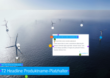
The “Hotspot Image/Video” module displays an image or video with interactable hotspots that can be freely positioned by the editor. These hotspots can either open a layer (small window) or a link.
Descriptions can be added to the layers, which are displayed when interacting with the hotspot. It is possible to interact either by clicking or by mouseover.
This module is particularly suitable for displaying and describing detailed technical visualizations.
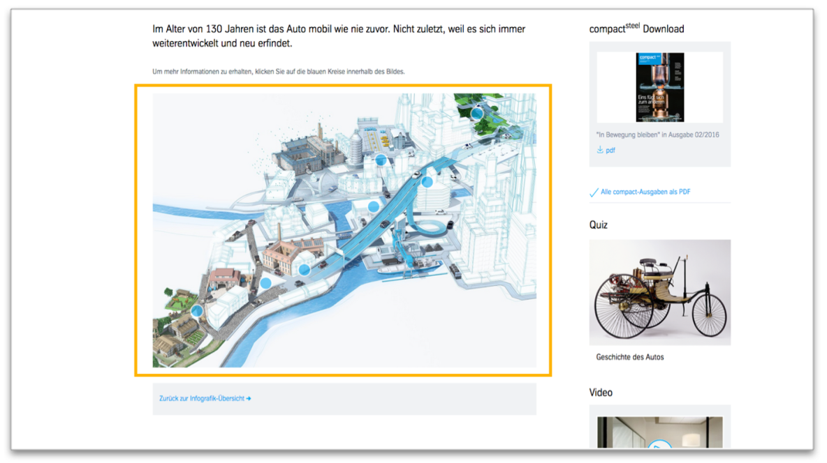
Example page view
The module is marked in orange.

Hotspot Image in the content area
This is how the module works
The module consists of the following components:
| Content | Description |
|---|---|
| Text above the heading | text above the headline displayed in blue stripes |
| Heading | positioned on the image in blue stripes |
| Caption | displayed below the image in left corner |
| Media type | There can be two media types |
| 1. Image | Resolution: width 1334px |
| Category and headline | - optional - Text is positioned on the image in blue stripes |
| 2. Video | - Video ID from YouTube, Vimeo, Cinema graph(Flixel) or video URL for HLS Video or external video file |
| Lightbox option | It is recommended to use hotspots only for autoplay videos. Also, it should not be possible to open the video in a lightbox. |
| Thumbnail | Cropped image: width 335 px or width 450 px for mobile view Note: The play button is automatically positioned on the thumbnail. |
| Default hotspot settings | - applies to all hotspots - can be overwritten for each hotspot individually |
| Appearance | |
| Color | - transparent (only visible in CMS) - primary color of the project (default: blue) - secondary color of the project (default: dark blue) - primary signal color of the project (default: orange) - red - green - turquoise |
| Shape | circle or rectangle |
| Icon | - No icon - '+' icon (only for circle shape) |
| Width & Height | input possible in pixels or percent |
| Rotation | rotation of the hotspot around its own axis (in degrees) |
| Event | |
| Click Event | what should happen when the hotspot is triggered? - opens layer - opens link |
| Link | only visible if hotspot opens link - all kinds of link possible - always triggred by click |
| Trigger | only visible if hotspot opens layer When should the layer be opened? - by click - by mouseover |
| Hotspots | any number (Note: The mobile view turns the hotspots into a slider with jump marks as buttons) |
| Title | positioned on the hotspot popup in blue stripes |
| Position of the hotspot | Indication in pixel or percent from the top left corner of the image. |
| Customize hotspot | - if selected, the hotspot can be customized individually - options are the same as general settings - if not selected, general settings will be used |
| Hotspot event | - can be customized - options are the same as general settings |
| Layer | |
| Text | Position of layer :- Indication in pixel or percent from the top left corner of the image. - Sub-headline - Free text field without formatting options |
| Link | - optional - internal or external - multiple links possible |
The module can be used in the following templates and page areas:
stage
content
stage
right
bottom
full-width
default
sidebar
The blue area indicates that the module is applicable in this content area.
Dimensioned screenshots


