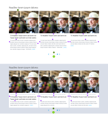
The “Image Teaser Slider” displays multiple image teasers in a row, which can be shifted (“slided”) left or right using arrow keys. This module is primarily suitable for providing teasers to large volumes of content on a small area of the screen.
Example page view
The module is marked in orange
_image_h664.png)
Image Teaser Slider in the footer area of a page
This is how the module works
There are various display options for the Image Teaser Slider:
- One box: In the main content, the module is displayed at full width, and always contains only one single image teaser.
- One box across full width: In the main content, the module is displayed at full width, and always displays only one single image teaser at a time.
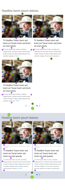
- Two boxes: In the main content, the module is displayed at full width, and always displays two image teasers simultaneously.
- Three boxes: In the main content, the module is displayed at full width, and always displays three image teasers simultaneously.
- Four boxes (only in stage and bottom): This mode only works in the stage area and the bottom area.
- Background colour grey/white: can only be selected in the stage and bottom, otherwise the background is white
| The module consists of the following components: | |
|---|---|
| 1. Headline
| displayed centred above the slider |
| 2. Teaser | - any number - Image and/or video teaser possible |
| Image | - typically three or four in a row - 4:3 format, must be at least 450px wide |
| Video (optional) | Video ID from YouTube or MovingImage24 - the play button is automatically displayed on the thumbnail |
| Kicker (optional) | Character limit: 84 for three teasers and 77 for four |
| Headline/teaser text | Character limit: 78 characters for three teasers and 77 for four |
| Teaser text (optional) | Character limit: limited to 340 characters for three teasers and 280 for four |
| Link | - internal or external Note: The entire teaser is linked, including the image. The teaser can also be displayed without a link destination. |
| 3. Slider navigation | This will only be displayed if the slider contains more individual teasers than can be displayed simultaneously. |
The module can be used in the following templates and page areas:
stage
content
stage
right
bottom
full-width
default
sidebar
The blue area indicates that the module is applicable in this content area.
Dimensioned screenshots

Description: Spacing values used in the dimensioned screenshots


