Table (02_02)
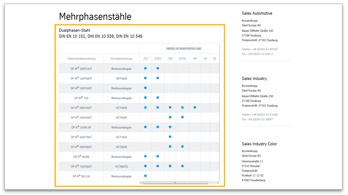
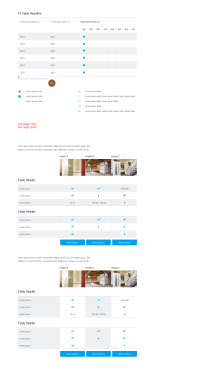
The “Table” module is well suited for displaying product specs, data, key figures, etc. It is used on article pages in the content area and consists of a headline, the table header and an individual number of columns, rows and cells. Different content can be displayed within the cells.

Table in the content area
This is how the module works
| The module consists of the following components: | |
|---|---|
| 1. Headline | - small headline (optional) - large headline - displayed centred above the chart |
| 2. Table head | the first or the first two lines represent the headlines |
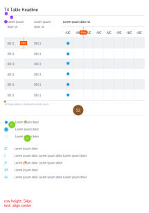
| 3. Lines, columns and cells | - The lines alternate in background colour (grey/white), which is set automatically - The first column, the second column, or both, can be defined as the main column, as a result of which it is displayed wider. Elements of cells in main columns are left-aligned as standard. Within normal cells, content is aligned centred as standard. These settings can be adapted (standard, left-justified or centred). - Cells can be connected with one another completely freely across multiple lines and columns. - Width and height of the cells is determined based on contents. |
| Column contents | - Text (formatting: bold, superscript/subscript) - Links (internal, external, download, button) - Images (cropped image: 160x85px) - Different icons (e.g. blue dot, grey circle) |
The module can be used in the following templates and page areas:
The module can be used in the following templates and page areas:
stage
content
stage
right
bottom
full-width
default
sidebar
The blue area indicates that the module is applicable in this content area.
Dimensioned screenshots


